Delta Cobrand Amex: Flight Checkout Upsell Optimization
Redesigning a revenue-critical moment in the booking flow to increase conversion without disrupting purchase intent.
Role: Lead UX Researcher
Scope: Checkout, Hybrid App, Application Flow (Desktop + Mobile)
Methods: Moderated usability, behavioral analysis, A/B testing
Impact: +5.5% NAAR (New Accounts Acquired / Banner Impressions)
Context
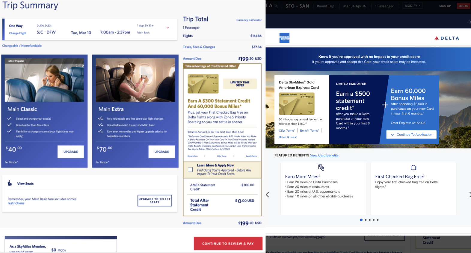
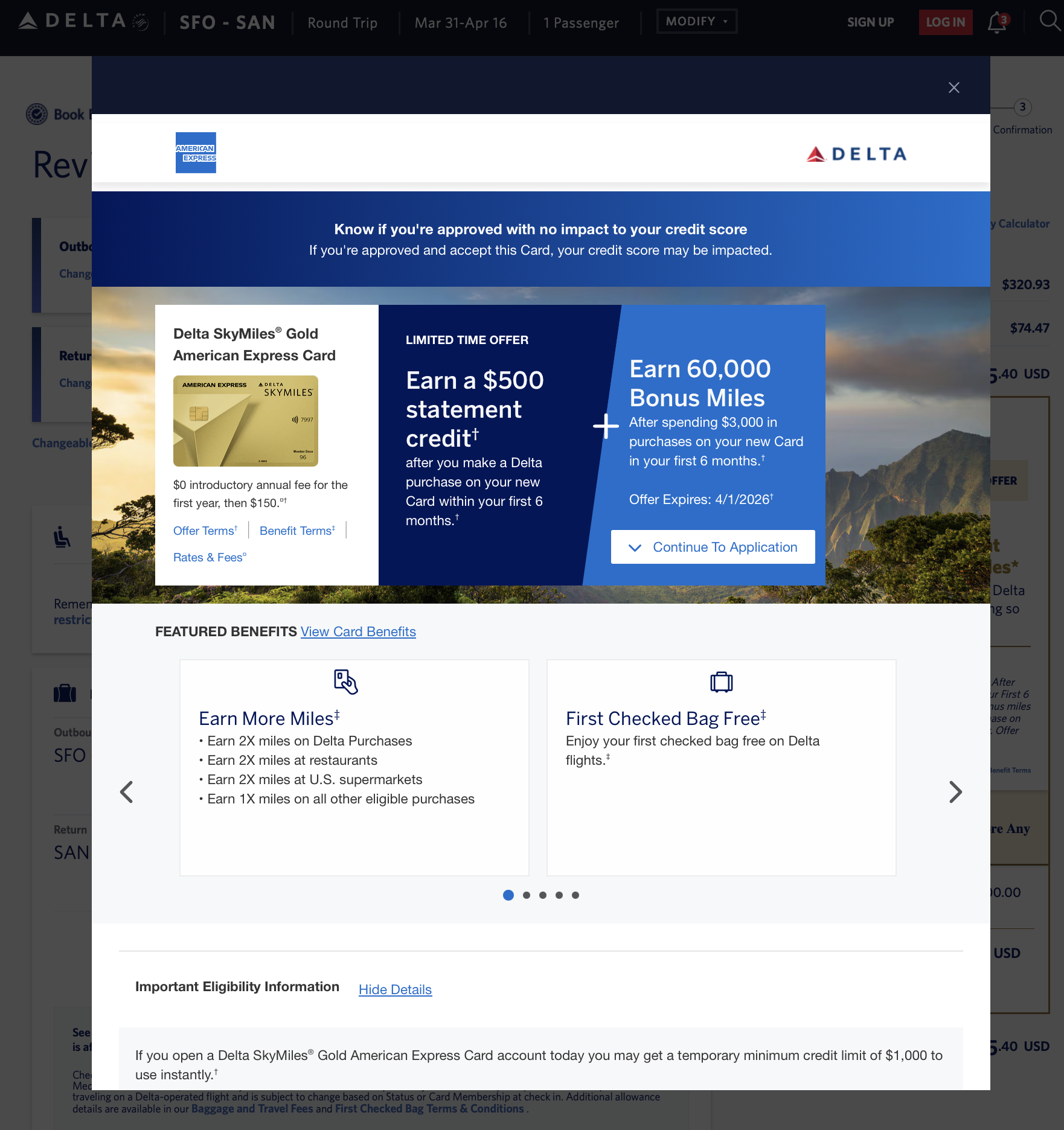
Delta was evolving beyond a static, standalone credit card application toward a Hybrid App experience embedded within the flight booking journey.
The goal was to increase card applications by introducing the offer earlier - within a high-intent transactional moment while maintaining booking completion.
This created a complex, multi-surface experience spanning:
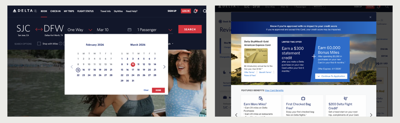
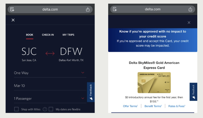
• Booking flow
• Checkout modal
• Hybrid app exploration
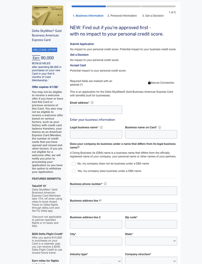
• Full application flow (desktop + mobile)
The core question became:
How might we introduce a credit product into a high-velocity purchase flow without disrupting user momentum or conversion?
Problem Framing
Users entered checkout with a clear goal: complete their flight purchase quickly. However, the business introduced a competing objective:
• Drive credit card exploration and application mid-transaction
This created tension between:
• User goal: speed, certainty, completion
• Business goal: engagement, exploration, conversion
Early hypotheses focused on UI improvements, but research reframed the problem as:
A decision architecture issue, not a visibility or usability issue.
We needed to understand:
• When users expect value to be introduced
• How much cognitive load the moment can take
• Whether the explore → apply sequence aligned with user intent
• How interaction patterns differ across desktop vs mobile
Research Strategy
I designed a mixed-method research strategy focused on observing real decision-making behavior within a live transactional context.
Methods included:
• Remote moderated usability sessions (desktop + mobile)
• Simulated booking flows with embedded upsell moments
• Behavioral observation of Hybrid App exploration and application flow
• Partnership with Analytics to evaluate A/B test performance
Participants:
Users mapped across acquisition personas (e.g., Credit Confident, Budgeting Guru) to capture variation in financial mindset and decision behavior.
Focus areas:
• Timing of benefit surfacing
• Cognitive load during checkout
• Information hierarchy and sequencing
• Decision velocity under time pressure
• Cross-device behavioral differences
This approach prioritized in-the-moment behavior over stated preference.
Behavioral Insights
1. Benefits were expected earlier in the journey
Users looked for value signals before committing attention, not mid-checkout. Delayed surfacing reduced engagement.
2. Explore → Apply introduced unnecessary friction
The additional step increased cognitive load in a time-sensitive moment. Users preferred a more direct path:
→ Quick understanding → Decision → Return to booking
3. Mobile amplified cognitive strain
Limited screen real estate made information feel dense and fragmented. Key actions (e.g., Apply) were visually buried.
4. The issue wasn’t information quantity, but sequencing
Users were not overwhelmed by content itself, but by how and when it was introduced relative to their primary task.
Emerging design principle:
In transactional moments, clarity and speed outweigh depth.
Business Impact & Decisions
Rather than limiting findings to UI refinements, I positioned the problem as a decision velocity and information hierarchy challenge within a revenue-critical flow.
Key recommendations:
• Surface key benefits directly within checkout (not gated behind exploration)
• Reduce friction between discovery and application
• Reorder content hierarchy to support faster decision-making
• Optimize mobile layouts for scannability and CTA visibility
• Validate structural changes through unmoderated testing at scale
Outcome:
While initial stakeholder direction leaned toward incremental UI changes, aligning research with analytics reframed the opportunity.
Because the Hybrid App was a partner-driven initiative with strong marketing sponsorship, marketing pushed to begin with lower-risk UI refinements. However, analytics told a story similar to UXR. A/B tests showed a -14% impact in new accounts acquired.
What Happened Next
To operationalize findings, I partnered with Product to co-design and facilitate a cross-functional working session across:
• Product
• Design
• Engineering
• Analytics
• Marketing
The session focused on:
• Aligning behavioral insights with business metrics
• Evaluating trade-offs between quick wins vs structural changes
• Defining a phased rollout strategy
This shifted stakeholder conversations from:
“Where should we place this content?” to: “How do we design upsell moments around user decision velocity in high-intent flows?”
Learnings & Insights
1. Transactional moments operate under different cognitive rules than exploratory experiences
2. Conversion is often driven by timing and sequencing, not just content quality
3. Mobile experiences amplify structural weaknesses
4. Revenue optimization requires balancing business goals with user momentum
5. Strategic influence often comes from reframing the problem, not just delivering findings
6. Durable impact comes from principles and systems, not one-off screens